
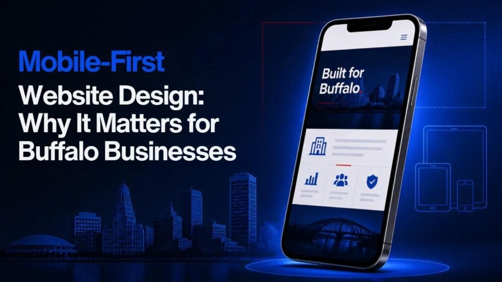
Mobile-First Website Design: Why It Matters for Buffalo Businesses is an important topic for companies that want to attract local customers, improve website usability, and generate more enquiries online. People often use their smartphones to find services and compare businesses, to read reviews, and to get in touch with companies as they travel. Visitors could abandon the site before they get to know the business if it is hard to navigate on a small screen. A Web Designing Agency Buffalo NY can assist businesses in building websites that function effectively on tablets, mobile phones, and desktop computers. Focus on the mobile experience, page speed, easy navigation, and contact information to deliver a better customer experience and ensure that customers can take action more easily.
What Is Mobile-First Website Design?
A mobile-first website design starts with a design and development process that focuses on creating a site for smaller screens and then scaling it up for tablet and desktop versions. The designers concentrate on the most crucial content and functions from the start, rather than designing a big desktop site and squeezing in everything on a phone screen later.
This enables businesses to consider carefully what they most want visitors to have. For instance, a person looking for a plumber, roofing company, landscaping firm, or marketing agency might wish to get service details, know their service area, read their reviews, and request a quote rapidly.
These should be easy to do and not make users zoom, scroll through irrelevant content, and squirm to manipulate small buttons.
Mobile-First vs. Responsive Website Design
Mobile-first design and responsive design go hand-in-hand, but they are not synonymous.
| Feature | Mobile-First Design | Responsive Design |
|---|---|---|
| Starting point | Begins with smaller screens | Can begin with mobile or desktop |
| Design priority | Essential mobile content and functions | Adapts layouts to different screen sizes |
| Content decisions | Prioritises what mobile visitors need | Adjusts content presentation across devices |
| Performance focus | Encourages lightweight mobile experiences | Performance depends on implementation |
| Best approach | Useful for planning mobile usability from the beginning | Important for supporting different devices |
Mobile-first and responsive can be the same website. The mix of these can be a practical solution for the majority of Buffalo businesses to deliver a uniform user experience across devices.
Why Mobile-First Design Matters for Buffalo Businesses
Businesses in Buffalo vie for visibility on search engines, social media, online directories, and local ads. A lead could find a company using a Google search, check out their website on their mobile phone, and immediately call, request a quote, or move on.
Making this first interaction easier is a mobile-friendly website.
1. Customers Often Search on Smartphones
Individuals can look for local service when they are on the go, on a break at work, or for an unexpected issue. If you are a homeowner with a leaking roof, you could check out the various contractors through a phone call and start calling one right away.
When the site is not mobile-friendly, key content can be hard to locate. If the text is too small, some sections are overlapping, images take a long time to load, and menus are complicated, visitors will lose interest in the site.
Important information is readily available with a mobile-first approach, such as:
- Services offered
- Business hours and service areas
- Contact information
- Customer reviews and testimonials
- Quote request forms
- Clear descriptions of the next step
It’s important to think about what questions your customers are likely to have and have answers readily available on smaller devices.
2. A Better Mobile Experience Can Support Conversions
Traffic is only helpful if visitors can find some type of value or helpful information, and can take the action that is important to the business. Those actions can vary by company, such as calling, booking an appointment, requesting an estimate, filling out a form, or purchasing a product.
A mobile-first design can minimize barriers between a visitor and these actions.
For example, a landscaping business could have a clear quote button towards the top of their mobile home page. A professional services organization can, for example, offer a brief type with just the necessary fields. The online store could help with product choices and the checkout process.
These changes won’t ensure more conversions, but they can make the website more user-friendly and guide the customers through the customer journey.
3. Mobile Usability Supports Search Performance
Usability is a crucial component of building a website that is accessible to users. Google’s main focus is on the mobile version of the content on a site, so businesses should make sure that the key content is there and accessible for mobile devices.
A mobile-first website should provide the same essential content, relevant metadata, structured data where appropriate, and useful internal links as its desktop version. Hiding important service information on mobile can create problems for users and search visibility.
But having a mobile design isn’t enough to ensure good ranking. Search performance is also influenced by the quality of the content, relevance, technical accessibility, site structure, competition, and other factors.
A Web Designing Agency Buffalo NY can utilize an SEO strategy in order to make sure that the site is created with people in mind and found by search engines.
4. Faster Pages Help Visitors Find Information
You want people to stay on your page because if it takes a long time to load, they’ll leave, particularly on a mobile connection. If a website is slow, it might be due to large images, scripts you don’t need, too many animations, or bad hosting.
Efficient loading speed should be the first consideration for any plan to create a mobile-first website, not any extra loading effects.
Useful improvements include:
- Compressing images without noticeably reducing quality
- Using modern image formats when supported
- Removing unnecessary plugins and scripts
- Loading below-the-fold images when appropriate
- Reducing render-blocking resources
- Choosing suitable hosting and caching settings
- Testing performance on real mobile devices
Another useful feature is the ability to track Google’s Core Web Vitals, which track elements of loading performance, responsiveness, and visual stability.
5. A Professional Mobile Design Builds Trust
The first impression a visitor has of a business is likely to be on the website. If the mobile design is dated, it’s hard to locate the contact information, or buttons aren’t working, it raises questions about the professionalism of the company.
A clean mobile design aids in conveying business details in an arranged and coherent manner. The use of readable typography, clear headings, relevant photos, honest customer reviews, and visible contact options can make the experience more reassuring.
Where local enquiries are crucial to a Buffalo business, trust-building must be very easy to find and not be overwhelming.
Business information is something that should be accurate; businesses should be using actual testimonials, not claims or misleading design.
Essential Features of a Mobile-First Business Website
Creating a mobile-first website isn’t quite as simple as just building a website that fits on the phone screen. The design should also facilitate the kind of actions that visitors wish to perform and make the most important information in the business easily visible.
Clear Navigation and Simple Menus
When you have a large desktop navigation menu, it can be difficult to use on a smaller device. The goal of a mobile layout is to display pages on a device in an intelligent manner and guide visitors to the key areas without requiring extraneous taps.
The services menu for a service business can be a simple menu with links to services, about, service areas, reviews, and contact info. For a business that provides numerous services, categorizing different pages can help users find the right one faster.
Menus should be easily opened and closed, and vital links should not be trapped behind confusing labeling.
Readable Text and Appropriate Spacing
Normal site text should not require zooming to view. The size of the text, line spacing, length of paragraphs, and contrast all have an impact on readability.
Designers should also leave adequate room between buttons and links so as to minimise accidental taps. Content should fit on the smaller screens naturally, rather than horizontally scrolling the screen.
Clickable Phone Numbers and Options
A clickable phone number is useful for businesses that accept phone calls, as it simplifies contacting the company. Email links, appointment buttons, and quote request forms should, too, function well on mobile devices.
Contact forms should only require the information that is required to answer the enquiry, rather than work up the visitor. Easier to understand with clear error messages and confirmation messages.
Mobile-Friendly Images and Media
Photos can be used to describe services and demonstrate quality work by a company, but if they are too big, they can make a page slow to load. Businesses should ensure that the images they use are the right scale and keep background videos or heavy animations to a minimum.
Images should also be used to augment content. Several large decorative images that contain little information may be more useful to a local contractor than to a project photographer who has photos of the project.
Accessible Design
Accessibility ensures that a site can be used by a larger audience, including those with disabilities who use assistive devices such as screen readers, keyboards, or other assistive technologies.
Practices that can be useful are descriptive headings, meaningful image alternative text, enough colour contrast, visible focus indicators, appropriately labeled forms, and buttons with meaningful names.
Accessibility should be a consideration that is made a part of design and development processes and not made an afterthought.
How Mobile-First Design Helps Different Buffalo Industries
The optimal mobile design relies on customer interaction with a company. Content and actions that are most relevant for each industry should be given first priority.
| Business type | Useful mobile-first features | Main purpose |
|---|---|---|
| Roofing and construction | Service descriptions, project photographs, quote forms, click-to-call buttons | Help property owners request estimates |
| Landscaping and tree care | Service areas, seasonal services, project galleries, enquiry forms | Make service information and enquiries accessible |
| Law firms | Practice-area pages, attorney information, consultation details, contact forms | Help potential clients understand services and contact the firm |
| Restaurants | Menu, location, hours, reservation or ordering links | Make visiting or ordering easier |
| Retail businesses | Product categories, search, filters, clear checkout | Improve product discovery and purchasing |
| Marketing agencies | Service pages, case studies, portfolio examples, consultation forms | Explain expertise and encourage qualified enquiries |
These are all examples of why mobile-first design should start with the customer journey and not a template that is applied to all businesses.
Choosing a Web Designing Agency Buffalo NY
Choosing the web design partner requires more than just looking at the design. Businesses need to find a provider who has an understanding of mobile usability, technical performance, content structure, and the company’s commercial objectives.
Review Previous Website Projects
Request a look at websites created for businesses that fall within their target audience or have similar needs. Quickly use a web browser on the smartphone to determine whether the information is easy to read, the menu functions, images load quickly, and contact information is available.
An attractive desktop screenshot will not necessarily signal a good mobile experience.
Ask About Performance Testing
A professional agency ought to have the ability to describe the way they test site speed and discover technical issues. Inquire if the team implements tools like Google PageSpeed Insights and checks Core Web Vitals post-launch.
Results may differ based on device, network, page content, and test environment. The objective should be to find meaningful problems and enhance the actual user experience not to guarantee a score.
Understand the SEO Approach
The structure and technical implementation of a website may impact search engines’ discovery and understanding of website content. Inquire about their approach to mobile considerations, page titles, meta descriptions, heading structure, internal links, image optimisation, and local business information.
If the locality has significance, it should be declared clearly on the website, and the services provided and localities served should be included. You need to offer clearly distinct information on location pages that is not quite the same for each area.

Clarify Ownership and Ongoing Support
Before signing an agreement, make sure to verify who owns the website, domain, content, design files, and hosting account. Add up the cost of the package to check if it covers maintenance, backups, software updates, technical support, and security monitoring.
It is also important for businesses to know how much further changes will cost and if they are able to make their basic content updates independently.
Compare Value Rather Than Price Alone
The initial low cost could be for a product with missing features like mobile testing, accessibility enhancements, content preparation, analytics, or even post-launch support.
Ask for a clear proposal, distinguishing design development, hosting, maintenance, and optional services. Do research on what each provider actually offers before they’re chosen.
How to Measure the Success of a Mobile-First Website
Once launched, companies should assess visitors’ use of the website as well as its effectiveness in achieving company goals. If it looks good on a phone, it can’t be a good design.
Useful measurements include:
Mobile traffic: check for mobile visitors and which pages are visited.
Engagement: Look for behaviors such as users interacting with key content or leaving a page without doing anything else. Understand engagement metrics in context, as a short visit can meet a simple need.
Conversion rate: Monitor important actions like calls, quote requests, bookings, purchases, or completed forms.
Monitoring performance of the page: Loading, responsiveness, visual stability, and issues reported by the performance tools.
Form completion: Ensure that enquiry forms are completed by visitors to the website and identify any fields that are not essential or have technical issues.
Search performance: Get insights into the number of impressions, clicks, and queries that lead to a website on Google Search Console.
User feedback: Ask customers if they are able to locate information and report any problems using the site.
These measurements can be used to determine the possibilities for improvement. For instance, if there are a lot of mobile visits but not much enquiry coming in, then the conversion process of contacts may need to be looked at; however, there may be other reasons for this, like pricing, service relevance, and traffic quality.
Common Mobile-First Website Design Mistakes
A beautiful website can cause issues if the site isn’t carefully tested for mobile usability.
Designing for Desktop First and Shrinking Everything
Just zipping a desktop layout can lead to small text, clogged areas, and navigation challenges. A more effective method focuses on the key information and adjusts the design for mobile devices.
Hiding Important Information
When these useful service details, prices (where applicable), business hours, or contact information are stripped from mobile pages, it can make it more difficult for visitors to make a decision. Key information should be accessible on all devices.
Using Intrusive Pop-Ups
There can be pop-ups that can obstruct the content that visitors are looking for, especially on smaller devices. Pop-ups should be easily dismissed and should not impede the ability to access the information on the main page.
Ignoring Real Device Testing
The design preview could be accurate, but the site would not be as it is meant to be on phones. Test navigation, forms, buttons, images, and text on various screen sizes. Test the common browsers as well as the interactions the customer cares about.
Adding Too Many Features
Animations, sliders, chat widgets, and third-party scripts can make things more complex and impact performance. Each of the features should be functional and have a specific purpose. Eliminating redundant components can simplify the usage and upkeep of the website.
Conclusion
As Buffalo businesses seek to enhance their online presence and make their services easily accessible, mobile-first web design is a key factor to keep in mind. Every website should be quick to load, readable, easy to navigate, and enable visitors to complete value-added activities on their mobile devices.
A Web Designing Agency Buffalo NY can assist businesses in planning these features, optimizing the responsive design, ensuring website performance, and evaluating the website after launch. The best way to do this is to have a well-thought-out design that has useful content, reliable and secure functionality, and is accessible and constantly tested.
Businesses should not make mobile compatibility an afterthought when designing websites, but rather an integral part of the design process. This is a better base on which to build customer service on all devices and to sustain long-term growth online.
Frequently Asked Questions
01 What is mobile-first website design?
Mobile-first website design begins with the needs of smartphone users before adapting the layout to larger screens. It prioritises essential content, usability, and performance.
02 Why is mobile-first design important for Buffalo businesses?
It helps local customers access services, business information, and contact options more easily when browsing on smartphones.
03 Is mobile-first design the same as responsive design?
No. Mobile-first describes the design approach, while responsive design allows a website layout to adapt to different screen sizes. A website can use both.
04 Does mobile-friendly design improve SEO?
Mobile usability supports a better user experience, and Google primarily uses the mobile version of a site’s content for indexing. Rankings still depend on multiple factors.
05 How can I check whether my website works well on mobile?
Test it on actual phones, check forms and navigation, review page speed, and use Google’s PageSpeed Insights and Search Console to identify issues.
06 How much does mobile-first website design cost in Buffalo, NY?
Costs vary according to the number of pages, custom features, content requirements, integrations, and ongoing support. Request an itemised quote from each agency.
07 What features should a mobile business website include?
Useful features include readable text, simple navigation, clickable contact details, accessible forms, fast-loading images, and clear calls to action.
08 Can an existing website be redesigned for mobile users?
Yes. An existing website can be reviewed and improved or rebuilt, depending on its technology, layout, performance issues, and business requirements.
09 How does mobile page speed affect visitors?
Slow pages can frustrate visitors and make important information harder to access. Image optimisation, efficient code, and suitable hosting can help improve performance.
10 What should I ask a web design agency before hiring it?
Ask about mobile testing, performance optimisation, SEO setup, accessibility, website ownership, maintenance, project timelines, and the full cost of the work.